We're well into 2026, and the visual landscape is shifting as fast as you can say microtrend. As someone who spends most of her days behind a lens (or thinking about what makes an image work), I've been noticing some clear patterns in what's resonating and what's starting to feel tired.
Whether you're a brand planning your content calendar or an individual thinking about booking a shoot this year, here's my honest take on what's in, what's out, and what that means for you.
OUT: Over-edited, filter-heavy images
IN: Authentic colour grading with a consistent visual identity
The era of heavy presets slapped onto every image is over. What's replacing it isn't "no editing", it's a more intentional editing style. Kind of like "no-makeup makeup", where you're still doing a lot of work, but now also doing the work of concealing the work you did to make it look "effortless". A cohesive colour grade that's consistent across your whole feed, subtle enough to feel real but polished enough to feel considered. Brands and individuals alike are investing in a visual identity rather than just a filter, and the difference is immediately noticeable. Real photographers, retouchers, and colour-graders are essential for a cohesive look and feel. Hiring experts is always IN.
OUT: Perfectly curated, try-hard flat lays
IN: Lifestyle and "in-world" product photography
Products staged on marble countertops surrounded by flowers and candles? So 2000-and-late. What's connecting now is imagery that places products in real life, on someone's actual kitchen table, being used by a real human, existing in a space that feels lived-in. The goal is for your audience to see themselves in the image, not just admire it from a distance. If it looks like AI could have made it, it's not working hard enough.
OUT: Chasing every trend for the sake of it
IN: A consistent point of view
The accounts and businesses that are winning on social right now aren't the ones doing every trending audio and every viral format. They're the ones who have a clear visual world, and they show up in it consistently. That takes planning, good content, and knowing what you stand for visually. A great way to do this is through a social media series like the tongue-in-cheek episodes from the Brooklyn Coffee Shop on Instagram.
OUT: Overly polished, unreachable imagery
IN: High quality that still feels human
There's a sweet spot between "phone snap" and "untouchable glossy campaign", and that's exactly where the most effective content lives right now. Images that are beautifully shot and edited, but warm. Your audience wants to feel invited in. Designers are including more textures in their work. With analogue being in-vogue, film or digicam-simulations are still everywhere. Have you heard of texture-hunting? Love it!
OUT: Just posting pretty pictures
IN: Using your content to say something and stand for something
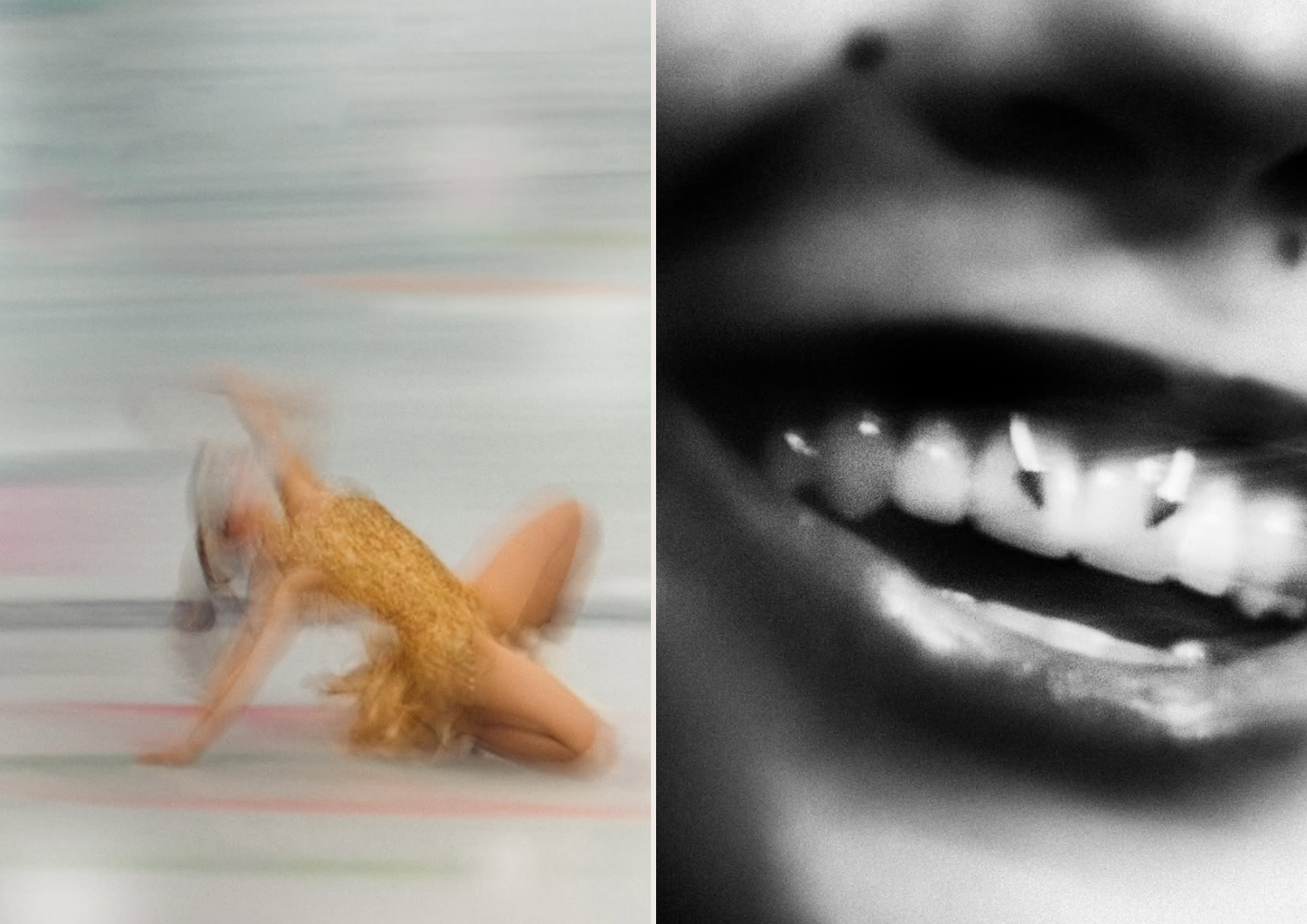
Recognise the pictures below? I love a blurry picture, so they immediately grabbed my attention for the craftsmanship on display. Only to learn the photographer, Matthew Johnson (@matthewjohnson) took these photos of the American Olympian Skater Alysa Liu (@alysaxliu) from his TV! He calls this series "Screen Time" and said the following in the comments:
"This particular series, “screen time” is a practice where I set up a screen or projection and use camera to photograph a live event or broadcast. I’ve explained this in the past but don’t go in depth every time I post something like this. I’m not trying to trick anybody! Most of my imagery is film photography, but this is one way I’ve enjoyed my art practice. Thank you for everybody who enjoys the work. Oh and never Ai."
Images that make you wonder: How did they do that always perform. It takes courage to stand out, but the rewards are so worth it.
OUT: Ignoring video entirely
IN: Reels and short videos as part of every content package
If you're still treating your photo and video strategy as completely separate things, 2026 is the year to integrate them. The brands getting the most traction are shooting stills and reels in the same session, same aesthetic, same art direction, one cohesive story across formats. It doesn't have to be complicated. It just has to be intentional.
OUT: The Beige minimalism aesthetic
IN: Maximalism and colour theory
Okay this might be a little biased because I'm a maximalist, but we're seeing a clear move away from the very matching-colours and beige minimalism normcore trend that had us all in a chokehold a few years ago. Now people are leaning more towards bolder, expressive colours and leaning towards complementary colours. There was a clear push-back to Cloud Dancer being Pantone's Colour of the Year, and I think we're all ready to see more intentional vibrance.
OUT: One big annual shoot
IN: Consistent, smaller shoots throughout the year
One big campaign shoot that has to last the whole year is a stressful, expensive way to manage content, and the images start feeling stale by month three. More brands are moving to a retainer model: smaller, more frequent shoots that keep content fresh, relevant, and reactive to what's actually happening in their business. Your feed stays alive. Your audience stays engaged.
So there you have it, my 2026 visual content report card. The common thread running through all of it? Intentionality. Less noise, more point of view. Less chasing, more owning your aesthetic.
If any of this has you thinking about your own visuals, for your brand or for yourself, I'd love to chat. Book a free 30-minute consultation here, and let's figure out what your content needs this year.
Hi! I'm Estée, a Cape Town-based creative & creator working with brands and individuals who want visuals that resonate.


